A Historic Victorian in San Francisco Is Meticulously Transformed Into a Modern Family Home

In San Francisco’s Alamo Square, Jensen Architects turns to the past to boldly reinterpret a storied historic home.
John Conomos, an established San Francisco builder and president of Drömhus General Contractors, was living with his family opposite Alamo Square when the Victorian next door went on the market. Although not apparent from its dingy exterior, the home was closely connected to the architectural preservation of the city itself. Living in the adjacent Edwardian—historic in its own right—Conomos and his wife Amanda had zero intention of moving. However, after fearing the possibility of a future buyer carelessly leveling the dwelling in favor of a nondescript mansion, they couldn’t escape the responsibility of restoring the home to its full potential. After devising a plan to fix it up carefully and resell it when complete, they eventually purchased the house next door.
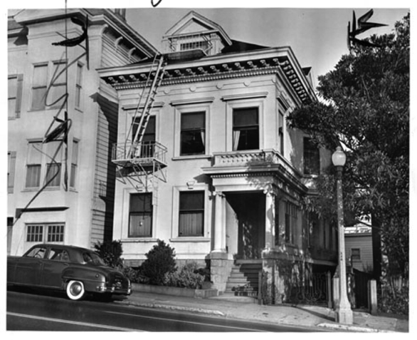
The home—it turns out—had quite a story of its own. In the 1950s, Verta Vinson, a prominent local figure and one of the founders of the Alamo Square Neighborhood Association, was living with her husband in an apartment fronting the park. Vinson was a vocal advocate for the preservation of the city’s Victorians at a time when the San Francisco Redevelopment Agency had their eyes on Alamo Square with plans for demolition. She was adamant that the character-filled Victorians spread throughout the city, especially in older districts like Western Addition, should be repaired rather than being torn down. When the property adjacent to her apartment went up for sale in 1955, Verta and her husband, coincidentally, bought the house next door. The property remained in the Vinson family for decades, with many generations calling it home.
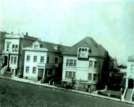
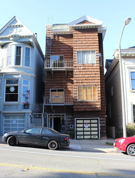
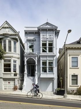
The historic residence had been severely disfigured over the years. Originally built in the Victorian Stick style in 1889, which would have included intricate trims and moldings, the home had seen numerous confounding facelifts in its lifetime. The facade was stuccoed over at one point, and subsequently blanketed in brown shingles (how it appeared when the Conomos family purchased it).
The home needed a complete overhaul, and the couple soon enlisted Jensen Architects to help reimagine the unique property. The team inherited a host of challenges, the most pressing of which was the muddled exterior, which no longer retained any historic integrity. After careful consideration and a historical evaluation of the building’s past lives, the team decided to recreate the original facade. In order to do this, they would reference the historic photographs and architectural clues on the building itself. The first step of the restoration, dictated by the city’s Historic Preservation Commission, would be to pull off the non-historic shingled facade, observe any scarring or shadow lines, and subsequently have the preservation staff conduct a site visit to visually inspect the stripped facade—all before any reconstruction could begin.
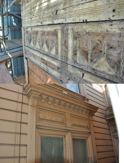
Shadows uncovered above the front facade’s second floor bay window matched original detailing above the paired windows on the intact east facade.
To lead the ambitious undertaking, the team turned to Skeeter Jones, founder of Clearheart Fine Design and Building. As both a carpenter and artist, Jones has restored countless Victorians across the city, which has become his artistic passion. Jones’ process at the Alamo Square residence hinged upon both historic evidence and creative improvisation. For Jones, one of the most important objectives in his work is to convey a “sense of place,” which is so critical in defining a city’s identity. In his mind, this is achieved through a strategic infusion of ornamentation and stylized elements that, although not original, are recognizably “of the period.” Jones meticulously resurrected the facade, improvising along the way with input from the Jensen team, especially in sections that remained inconclusive from historic evidence.
Although Jones expected the Jensen team to favor a simpler, more streamlined aesthetic in such areas, they gave him the green light to make the facade as intricate and detailed as possible, provided it was still “of the period.” Deviations from the original facade, although subtle, were thoughtful and strategic. Perhaps most notably, the street level bay window was omitted in favor of a garage—a functional necessity. They also incorporated trim that’s thicker and more prominent at the bottom, especially at the entry, for a more formidable look. These details included heavier handrails and posts, plus a thicker arched entry. For the recreated turnings, the team favored more substantial “shaft-like” columns made from 6x6s, instead of 4x4s. The entry vestibule is much deeper than it would have been originally. Additionally, the glass front door, transom window, and sidelights provide subtle modern cues that hint at the transformation to come beyond the transitional entryway.
From start to finish, the laborious facade reconstruction took five months to complete. Once perfected, it was time to select the exterior color, a decision that would have a big impact on the home’s presence in the historic neighborhood. A stone’s throw from Postcard Row, San Francisco’s famous lineup of dignified and vibrant Victorian “painted ladies,” the Jensen team and the couple had no interest in a kaleidoscopic color palette—a trend that actually didn’t come into fashion on Victorian exteriors until the 1960s. They also didn’t want to conceal or mask the exterior by painting it all black, an increasingly popular trend among renovated Victorians in the city. The team eventually settled on one color: a semi-reflective silver, whose nuanced metallic sheen is most evident up close. “We wanted the house to appear,” says Conomos, “like it was picked up by its foundation, dipped in silver, and put back down.”
“We wanted the house to appear like it was picked up by its foundation, dipped in silver, and put back down.”
– John Conomos, builder/resident
When the team turned their focus to the interior of the home, a vision unfolded that would prove to be a bold counterpart to the Victorian facade. John and Amanda Conomos and the Jensen design team, led by principal Mark Jensen and project leads Emily Gosack and Yusheen Yang, traded ideas back and forth—a collaborative process which, from start to finish, “was always fun,” says Conomos. Through design iterations, a critical shift happened that would inform the trajectory of the project. “We were developing it as if we were going to live in it,” says Conomos of the home, “so one day, we decided, okay, let’s live in it!” For his family of four, their home next door challenged the family living dynamic with its choppy (mostly original) layout, regardless of the fact that it wasn’t lacking in space. “You could be downstairs and not know the kids were playing upstairs,” says Conomos. Reflecting on what didn’t work for them in their current house, the team pushed forward with two core objectives: maximizing light and views on the long and narrow lot and fostering a sense of family and social togetherness through design.
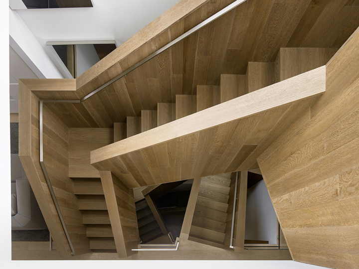
One of the most distinguishing design elements, the sculptural staircase, immediately commands attention upon entering the home. Clad in fumed and stained oak, the stairs are folded and contorted through the vertical space in an impressive display of architectural origami. Though a sculptural work of art, the stair was initially designed as a light well in order to meet the utilitarian need of maximizing light into the home. The stair design went through many iterations, beginning with a much simpler “repeating horseshoe” concept. The couple didn’t want something that had been done before and gave Mark Jensen the freedom to “push it” conceptually. “It’s no secret that architects are obsessed with stairs,” chuckles Jensen. The team rejected the conventions of other modern stair designs: often sleek, stacked constructs with cantilevered treads and glass handrails. “We wanted to strive less for ultimate transparency,” he explains.
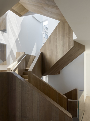
Due to the stair’s complex asymmetry and tricky articulation, the final design took multiple renderings to get it right. Once designed, fabrication and construction also proved challenging. The engineered European oak was treated with a custom finish by Hayasa Flooring Design and meticulously installed. “It was definitely one of the most technically challenging stair installs we’ve done,” says Hakob Karapetyan of HFD. The construction was challenging, but the result is unique—no two levels are alike. Apart from aesthetics, the stair was designed to function as a social space. “The design was derived from how the clients wanted to live in the house,” explains Jensen. To fill a void that was missing in their old house, the couple wanted the stairs to be a place where the kids could hang out and where people would want to gather during parties. The spacious landings have generous proportions for socializing, some with small windows and reading nooks. The stairs were even given their own zone of music.
“It’s no secret that architects are obsessed with stairs.”
– Mark Jensen, architect
The stairs’ folded volumes juxtapose solid wood forms with light-filled voids.
The stair features custom installations by lighting designer Johanna Grawunder. When turned off, the panels appear as mirrors. When on, they reflect LED lights, giving the twisted stair forms an exaggerated “funhouse-like” effect.
Opposite the stair, the elevator was another opportunity to strategically bring more light into the home. The standard Acme model they chose was tweaked with after-market modifications to fit the home’s aesthetics. Walled on one side in glass, the elevator itself becomes a focal point, with mechanical elements left intentionally exposed and its shaft acting functionally as a vertical light tunnel.
The home’s elevator features a glass cab and exposed mechanical elements. The already high Victorian ceilings were extended vertically to the top of the attic’s pitch, where a skylight was added.
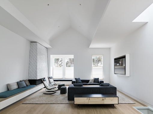
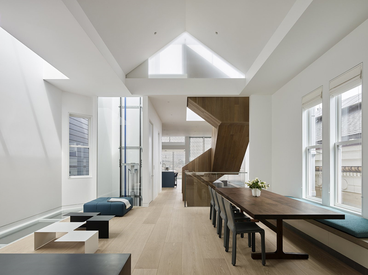
The team inherited soaring ceilings that were original to the home, with heights reaching more than 11 feet on the second and third floors. When Conomos popped his head into the attic after initially purchasing the home, he noticed there were another seven vertical feet to the top of the pitch, presenting a unique opportunity to extend the third-floor ceiling height even further. They subsequently decided to punch through that attic space, making the living level on the third floor dramatically more open and expansive. Positioned between the stair and elevator, the fourth-floor penthouse skylight falls directly at the top of the former attic pitch, beautifully framing incoming light from above. Walkable skylights were also incorporated along the western periphery of the home. The long and narrow structural glass panels are positioned for foot travel on the roof and third floor, which filter light to the floors below.
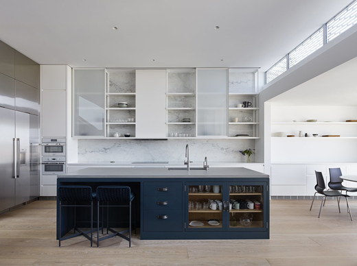
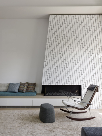
While navigating decisions about the home’s overall layout, a reverse floor plan was favored, with social spaces localized at the top of the home to take advantage of the best light and views, and the bedrooms at the bottom. This practical approach was also reflective of how the family intended to prioritize their time in the home. The open kitchen anchors the third-floor social space, abutting the family room and sun room. The kitchen space, largely stark and muted, gets an unexpected pop of color at the center island, with teal cabinet fronts and coordinating counter stools. The saturated color pairing makes for a maximum visual impact. The teal color, chosen by Amanda, was the jumping-off point for all of the other color cues throughout the home’s interior. In the living room, which faces the park, an angled fireplace is clad in tile from Waterworks. During construction, the team looked at grout samples for the fireplace for weeks, and in the end, made the decision to forego grout altogether.
The home’s kitchen features dual Miele ovens, a Thermador refrigerator and freezer, and a Thermador induction cooktop. A feature wall clad in natural Carrara marble sits behind sliding cabinet uppers. Heron counter stools by Paola Lenti in ‘verde scuro’ coordinate with custom cabinet fronts, which are accented with Spinneybeck leather pulls.
Interior designer Holly Hulburd of Hulburd Design closely collaborated with the team in assembling a design palette that would complement—not compete with—the home’s unique architecture. It was important that the interior design “grow with the house, not in addition to the house…to respect and address the strength of the architecture,” says Hulburd. Throughout the home’s interior, materials and furnishings have clean lines and a minimal aesthetic. Every piece was chosen with intention. Bold texture and color (mostly green hues) were added strategically for depth and visual intrigue.
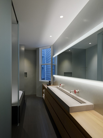
The home’s private spaces, taking a back seat to the more expansive public spaces, have “everything you need and nothing more,” says Conomos. The rear-facing master bedroom, not exceptionally large, was designed that way intentionally. They didn’t want to make the room so spacious that they wouldn’t want to leave. “The whole point of the house was to be among people—no hiding away,” says Conomos. The adjoining master bathroom features Marmorino plaster walls, a custom concrete sink, and Pipe faucets from Boffi, offering a quirky and industrial touch.
The master bedroom, modest in size, features a Stark area rug and a wicker PK22 chair by Poul Kjærholm for Fritz Hansen.
“The whole point of the house was to be among people—no hiding away.”
– John Conomos, builder/resident
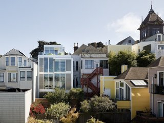
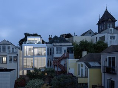
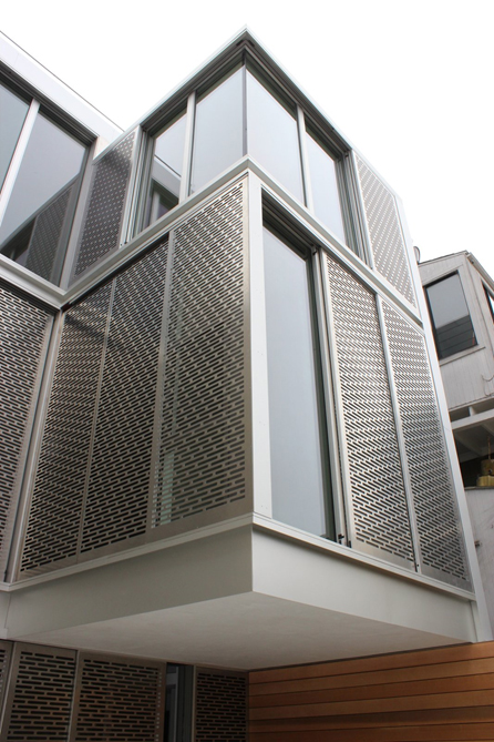
With a blank slate for the home’s non-historic and dilapidated rear facade, there was creative freedom to push the envelope. The Jensen team pitched the unconventional idea of a rear facade composed of metal. The cladding would be a subtle connective thread to the front facade’s metallic hue, but the similarities would start and end there. The elaborate composition took final form as a series of laser-cut aluminum screens that would be movable on motorized sliders. The team wanted to take advantage of the great views from the back of the home, and the addition of the screens would allow further privacy, light, and control. The idea, says Jensen, is that “you can re-tune the interior by moving the sliders.”
The home’s dramatic rear facade is composed of perforated metal screens by Flynn & Enslow, which are attached to Fleetwood windows. The second-floor bump out is cantilevered with no structural post below.
As functional as the concept was, it was also a “playful thing” that would allow residents to interact with the building. The impressive rear facade also features a cantilevered bump out that appears to float in suspension with no structural post below. In the third-floor sun room, the cantilevered projection includes two walls of glazing that come together at a seamless corner for maximum enjoyment of unobstructed views.
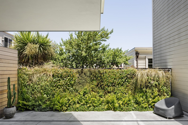
The team made the most of the “postage stamp-sized” backyard with the help of landscape architects Surfacedesign, who assembled a pattern of pavers that would be graphically interesting to look at. The living wall, by Habitat Horticulture, helps green the backyard in an organic and graphic way. “It’s simple, but it transforms the space,” says Jensen.
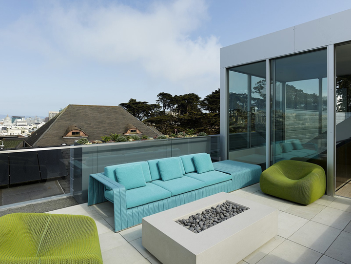
Boasting sweeping downtown views, the roof deck reconciles complex geometry to accommodate a staircase, elevator, and usable social space. A fireplace is surrounded by outdoor seating designed by Paola Lenti.
The vertical projections of the new stair penthouse and elevator penthouse were well within the height limits dictated by the city. The restored parapet on the front facade helps obscure the modern additions from public view, which is necessary for the project’s compliance. The outdoor space on the roof, however, was tricky to lay out within the context of the home’s surrounding programming. The challenge stemmed from the vaulted ceiling on the third floor, hitting a penthouse that’s square. “The view is great, but the geometry is complicated,” Jensen recalls of the roof deck. “It was like a 3D jigsaw puzzle.” The complexity required push and pull, and some of the decisions about placement of windows and openings happened live during framing. Eventually, the elevator, stairs, and an inviting rooftop social space all came together in harmony.
“The view is great, but the geometry is complicated. It was like a 3D jigsaw puzzle.”
– Mark Jensen, architect
In the end, the Alamo Square Residence is seemingly a house of contradictions: new and old, traditional and contemporary, muted and bold, simple and innovative. Beneath the surface, however, the disparate elements are woven together with a cohesiveness that allows it to be, at its core, a warm and functional family home. The genre-defying design (whimsically dubbed “Victorian fantasy” by Skeeter Jones) manages to push boundaries in the most beautiful way possible. With a reverent hat tip to the past, it quietly and confidently fits into the vibrant urban fabric of San Francisco, a city both rich in history and ever-evolving as a beacon for creativity and innovation.
Text by Sarah Akkoush https://www.dwell.com/article/alamo-square-residence-jensen-architects-143c21a0
DESIGN YOUR FUTURE TODAY!
Interior Designers Institute was founded in 1984 and is one of the few Interior Design Schools in California offering an Avocational Certificate Course, Associate of Arts Degree in Interior Design, Bachelor of Arts Degree in Interior Design, and Master of Interior Architecture Degree and is nationally accredited and also accredited by CIDA, Council for Interior Design Accreditation.