Decorating with Bright Colors

Bright colors are having their day and are no longer relegated only to kids’ rooms. Bring your home to life with cheerful and sophisticated hues straight out of the crayon box. With a little consideration and planning, you’ll create maximum impact that’s seriously grown up.
When decorating with bright colors, you first need to decide which neutral you want to pair with your color. By choosing a neutral, you can keep those brights in check. Consider what you want the focal point of the room to be and design the rest of the room around it. What kind of impact do you want to make? If it’s bold walls, keep the furniture neutral. Don’t forget to test your bright paint swatches before you commit to a specific shade. They almost always look different on the wall than on the swatch.
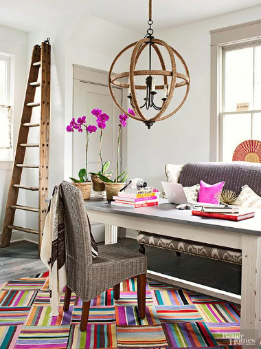
Pair bright accessories with some seriously chic neutrals. Gray walls, trim, and flooring provide a sophisticated backdrop for a showstopper rug in a bold graphic style. The coordinating orchids and purple pillows repeat the color found in the rug to make the room feel pulled together and intentional.
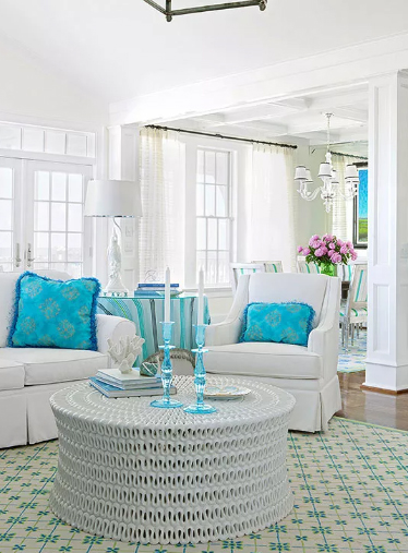
An all-white room is the perfect neutral foundation to make bright colors pop. Consider all the different textures and finishes of white to keep the room from falling flat. Add one or two colors at a time to make the overall look cohesive.
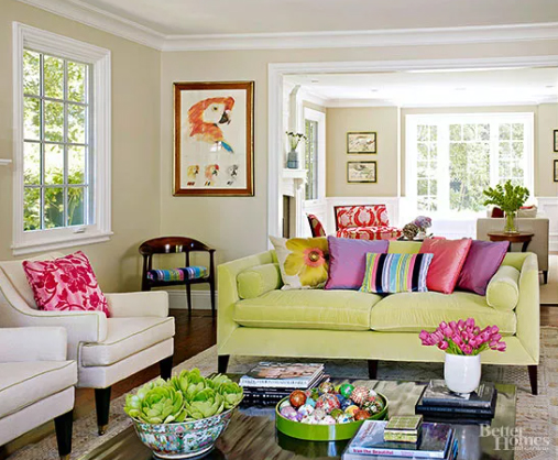
With bright colors, consider what your focal point is going to be to keep the room from becoming an eyesore. Allow your eye to rest by limiting your color palette to two or three colors plus a neutral. The green sofa is a delightfully unexpected pop of color, but it stays grounded with the pale walls and otherwise neutral furniture.
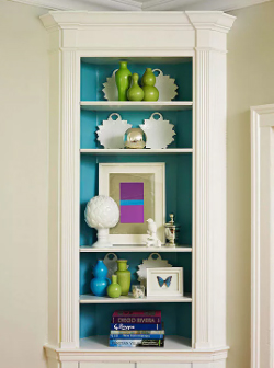
Bright turquoise provides an unexpected and happy pop of color painted on a built-in shelving unit. This look is all about high contrast and allows the items on display to shine. Consider what other elements you can use in your vignette that will provide contrast, visual interest, and color harmony.
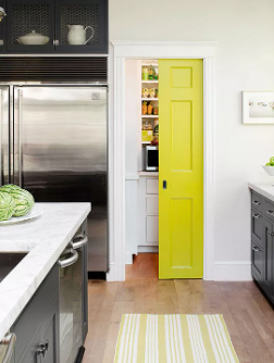
Pops of bright color can be the perfect unexpected surprise and add a lot of personality. This chartreuse pocket door completely changes the tone of an otherwise monochromatic kitchen with industrial undertones. It’s a cheerful little detail that makes all the difference.
Source: https://www.bhg.com/decorating/color/colors/decorating-with-bright-colors/
DESIGN YOUR FUTURE TODAY!
Interior Designers Institute was founded in 1984 and is one of the few Interior Design Schools in California offering an Avocational Certificate Course, Associate of Arts Degree in Interior Design, Bachelor of Arts Degree in Interior Design, and Master of Interior Architecture Degree and is nationally accredited and also accredited by CIDA, Council for Interior Design Accreditation.